GATTEX® Website Experience Design
I led UX design efforts for the GATTEX® website, a large-scale healthcare platform built to support complex user journeys, educational content, and data-driven experiences across multiple audiences.
Role: UX Designer (UX Lead for Figma & Documentation) | Company: Syneos Health | Tools: Figma, Jira, Wrike, Microsoft Teams, Adobe Creative Suite | Design System: Toro (Takeda) | Timeline: April 2025 – Launch (2026)
Overall Impact
Designed across 300+ Figma screens and submission documentation
Led UX design within a cross-functional global team (US + offshore)
Delivered a complex, multi-path healthcare experience
Ensured accuracy through extensive review and regulatory workflowsOriginal Focus: Simplify pet prescription management.
My Role
I was brought in to help lead UX design efforts in Figma, with a focus on both execution and documentation.
Designed and managed 300+ Figma screens
Created detailed submission documentation with redline annotations
Defined interaction behaviors for buttons, links, and flows
Collaborated across design, development, and stakeholder teams
Ensured designs aligned with the Toro design system

The Problem
The GATTEX® website required a highly structured, compliant, and user-friendly experience that could support:
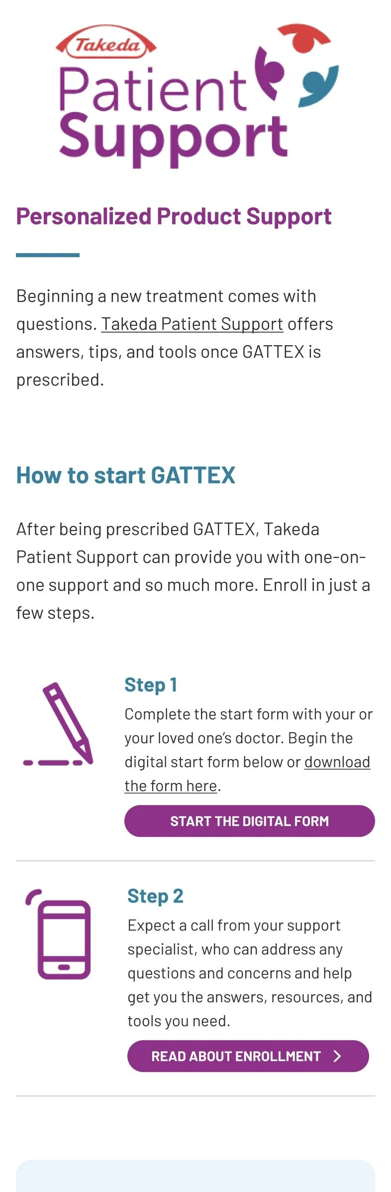
Multiple user types (patients, caregivers, healthcare providers)
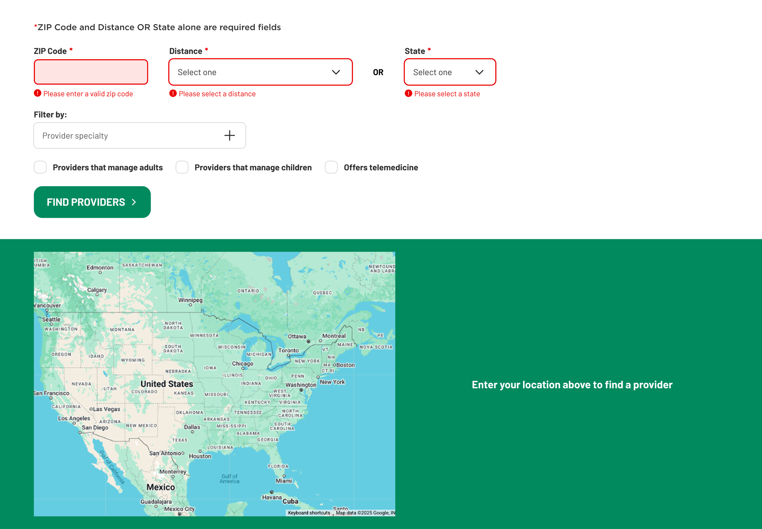
Complex questionnaire flows with branching logic
Educational content including video and data visualization
Strict regulatory and functional requirements
Balancing usability with compliance and technical constraints made the design process especially complex.
The Goal
Design a scalable and intuitive healthcare website that:
Supports multiple user journeys and pathways
Clearly communicates complex medical and product information
Integrates interactive elements like questionnaires and forms
Aligns with strict regulatory and design system requirements
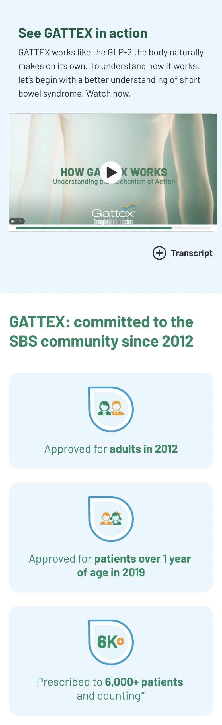

Designing for Complex User Journeys
The platform included dynamic questionnaires and multiple pathways, requiring careful planning of:
Conditional flows
Entry and exit points
Clear user guidance
I focused on simplifying these journeys while maintaining accuracy and flexibility.
Working Within a Design System (Toro)
Using Takeda’s Toro design system, I:
Built layouts using pre-defined components
Collaborated to create new components when needed
Ensured consistency across all pages and experiences
This required continuous alignment between design and development.
Cross-Functional & Global Collaboration
This project involved teams across:
United States (onshore)
India (offshore development team)
Using tools like Jira, Wrike, and Microsoft Teams, we maintained:
Daily communication
Weekly progress reviews
Iterative feedback cycles
Strong communication was essential to keep the project aligned across time zones and teams.
Iteration & Regulatory Review
All designs went through multiple rounds of PRT review, requiring:
Detailed annotations (red box documentation)
Functional clarity for all interactions
Continuous revisions based on stakeholder feedback
This process ensured the final product met both user needs and compliance standards.

The Solution
A fully realized healthcare website that:
Supports complex, multi-path user journeys
Communicates information clearly through structured content and visuals
Integrates interactive tools like questionnaires and forms
Aligns with enterprise design systems and regulatory requirements
Key Takeaways
Designing at scale requires systems thinking and documentation discipline
Clear communication is critical when working across global teams
Balancing user experience, compliance, and technical constraints is key in healthcare UX
Iteration and feedback loops are essential for complex product development